Yogosha Visual Identity


I’ve been challenged to redesign the Yogosha brand. Yogosha is a proeminent international Bug Bounty operation center. Their field of expertise is cybersecurity and companies cyber risk management.
1- ようごしゃ (Yōgo-sha)
The yogosha brand name comes from a japanese word meaning either ADVOCATE or DEFENDER. Hence the yogosha brand could use visual references to the japanese martial system, without using direct references as it’s neither a japanese company.
2- Yogosha is innovation
The Yogosha is a startup rooted in technology and the hacking world proposing a disruptive model. Their solution really helps companies simplifying their need to reduce the cyber-attack surface. Yogosha Brand should also bear reference to the startup/innovative universe, as opposed to a corporate/conservative one.
The proposition
Two main concepts leaded the brand redesign: binary code and Kamons.
Kamons are traditional samuraï families crests, Binary is the most low-level encoding system of every computer information.
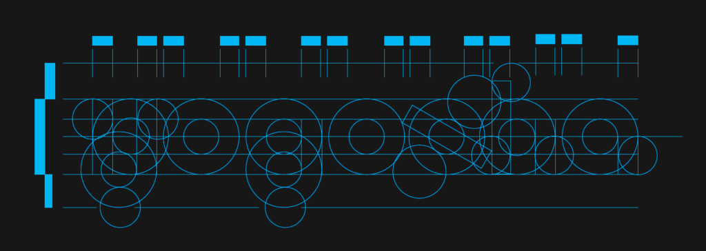
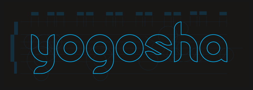
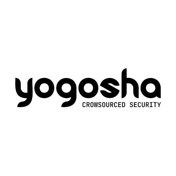
The lettering is composed of circles and bars as a visual equivalent to 0 and 1 of the binary encoding.
The logo ellipsis is the Y letter stylized as a kamon.
Illustration of the binary code visual system: 0 and 1, as circles and bars, composed the logo monospace lettering structure.
