Fixing the Army
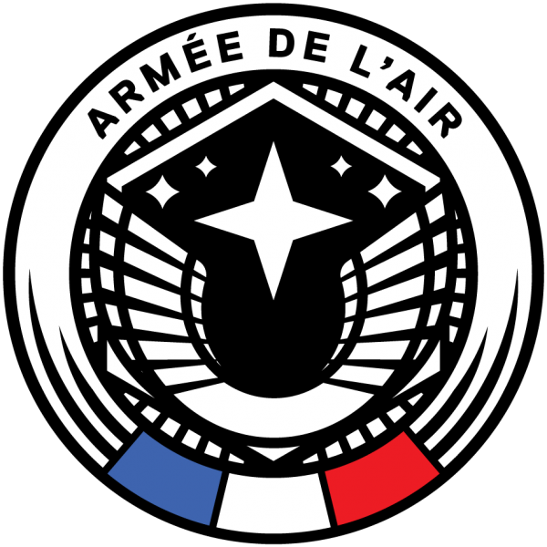
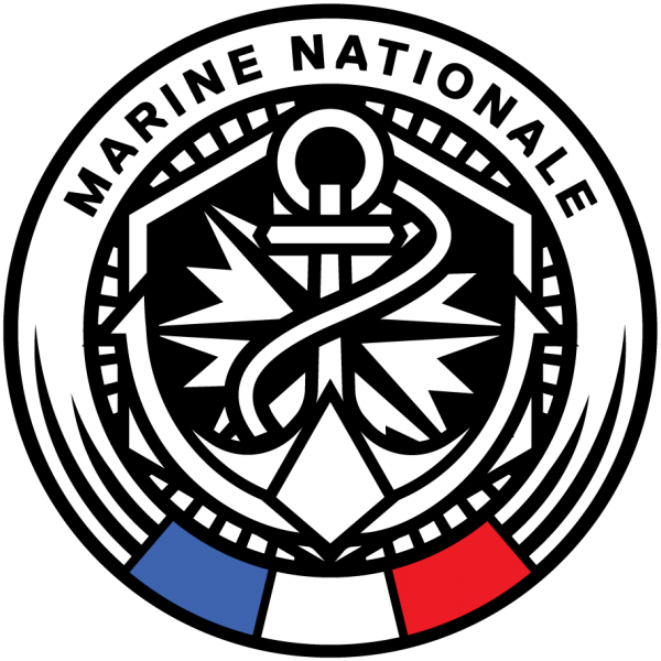

I’ve always had a passion for heraldry, particularly military heraldry. It’s a formal repertoire in which symbolism surpasses design. It’s a world of more or less cryptic codes, historical references and traditions.
I spent a lot of time researching the heraldic tradition of one of the world’s oldest and most glorious armies: the French Army.
The French Army has an impressive formal repertoire: every corps, every division, every section has an authentic coat of arms, each based on a rich history.
Disclaimer: the title “Fixing the Army” is a vile and gratuitous provocation. I don’t claim to know more than the army concerned about what it should do to represent itself, but when I see its current graphic identity, sterilized, eclipsed, I wonder where this richness has gone – this work is a proposal.
The angry subject.
An inflatable sword, an Angry Bird and a Wild Goose.
Time for a visual analysis of the existing logotypes of the three main french army corp, snarky analysis ahead. No pun intended on the army itself, but let’s try to have a critical look at it.
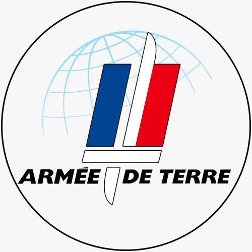
An Inflatable sword
The concept was to make an visual ellipsis of the dark side of the blade and the handle. but because both are reversed we end up with a very large sword looking like a toy.
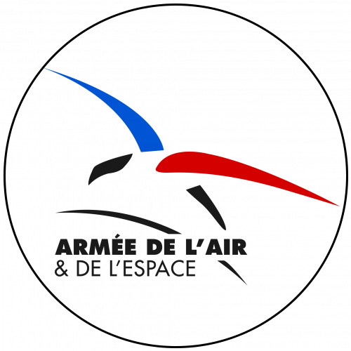
A wild goose
Do you see a predatory Eagle, or even something evoking power?
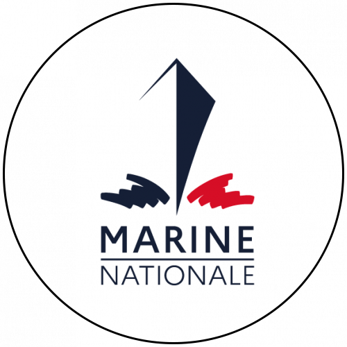
An Angry Bird
Do you see it?
No?
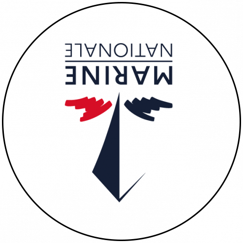
The Army has at least kept its sword, but what happened to the anchor of La Royale (the French Navy) and the wings of the Air Force?
These symbols have never disappeared! They are literally screwed to the body of the men, on every epaulet, every decoration, every flag and every epic of every battalion…
It’s a reminder that minimalism is a perilous exercise which rarely succeeds. I don’t pretend that I would have done better. I would have done it – differently -.
The worst-case scenario.
The worst-case scenario, but the definitive test of clarity, is to imagine how this design would look on a shoulder patch. This accessory is both systematic in the army corps, and technically very problematic: the weave imposes enormous constraints on a small surface.

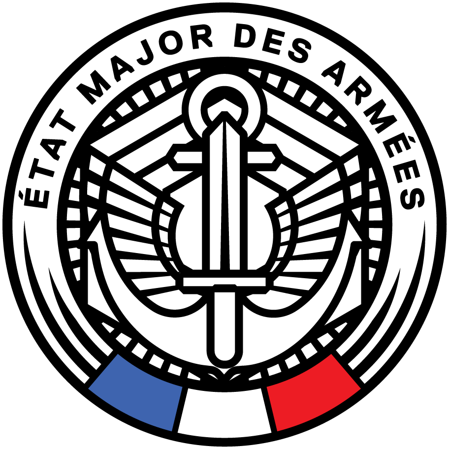
EMA (Etat Major des Armées)
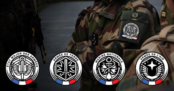
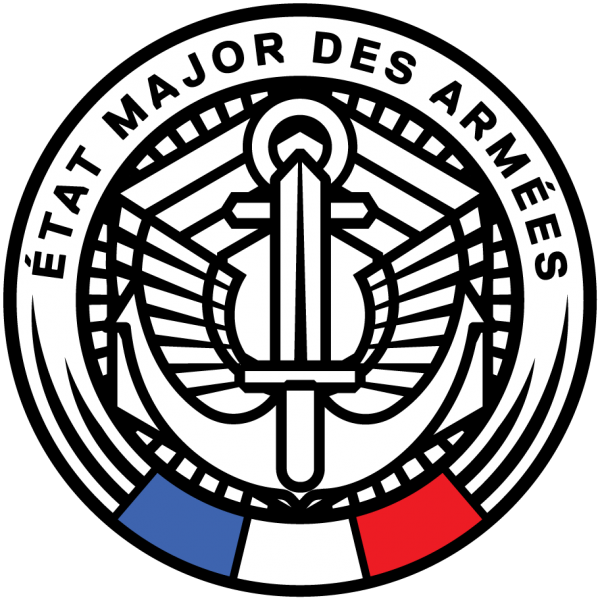
The EMA is the umbrella organization for the three main army corps: Air, Land and Navy. Its insignia bears the symbols of the three arms: sword, anchor and wings. In my view, this is good news: the EMA has kept the historical symbolism of the three arms, but it’s also paradoxical: if the arms are changing symbol, why is the EMA keeping the old ones?
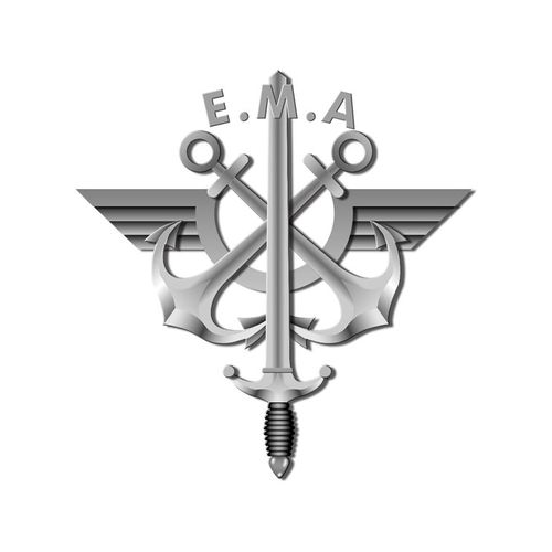
The challenge is to interweave these three weapons into one, without giving the impression that they’ve been thrown into the frame. The EMA’s current talking guns do a pretty good job of this, with just one exception: they become illegible on a small scale and in monochrome. This is due to the gradations and finesse of the design.
As if to add further complexity, the EMA logo often features the 5 stars of the General-in-Chief rank.
It’s a real challenge to keep so many elements legible on 25cm2.
Challenge accepted.
Proposal
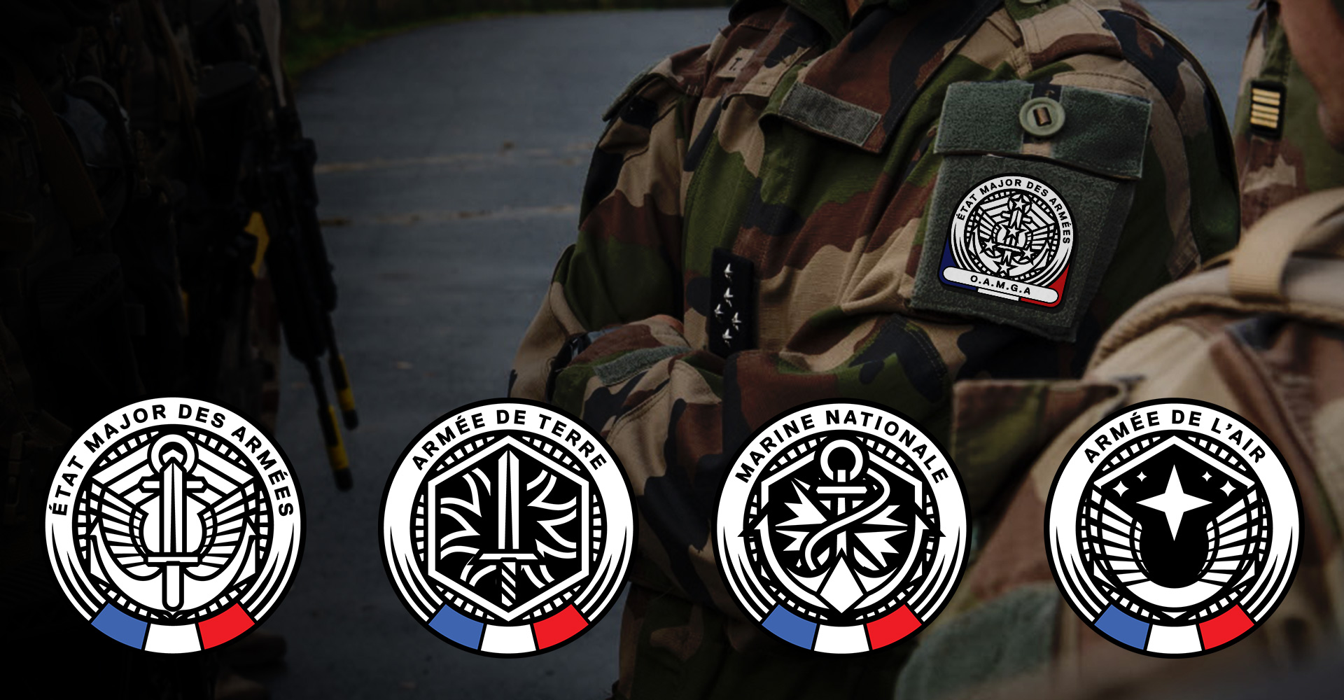
The bourdon (outline) bears the weapon’s name in a ring. In the center, a hexagon, the ubiquitous symbol of France. The graphic treatment with hatchings adds dynamism to this monochrome.
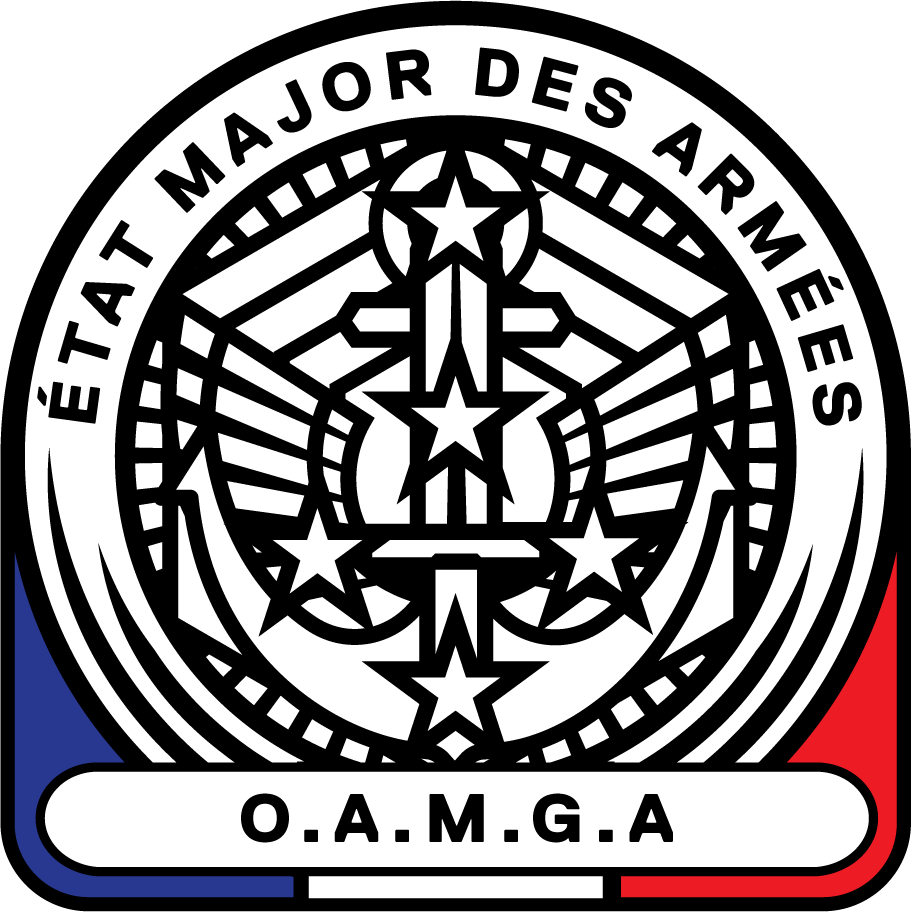
La Royale ( la Marine Nationale )
La Royale still is the nickname of the French Navy.
The cartouche background features a compass rose: a marine compass and, for the sake of uniformity, follows the principle of the EMA patch. The traditional anchor symbolism is BACK because it’s virtue is everybody knows immediately what it means at a glance.

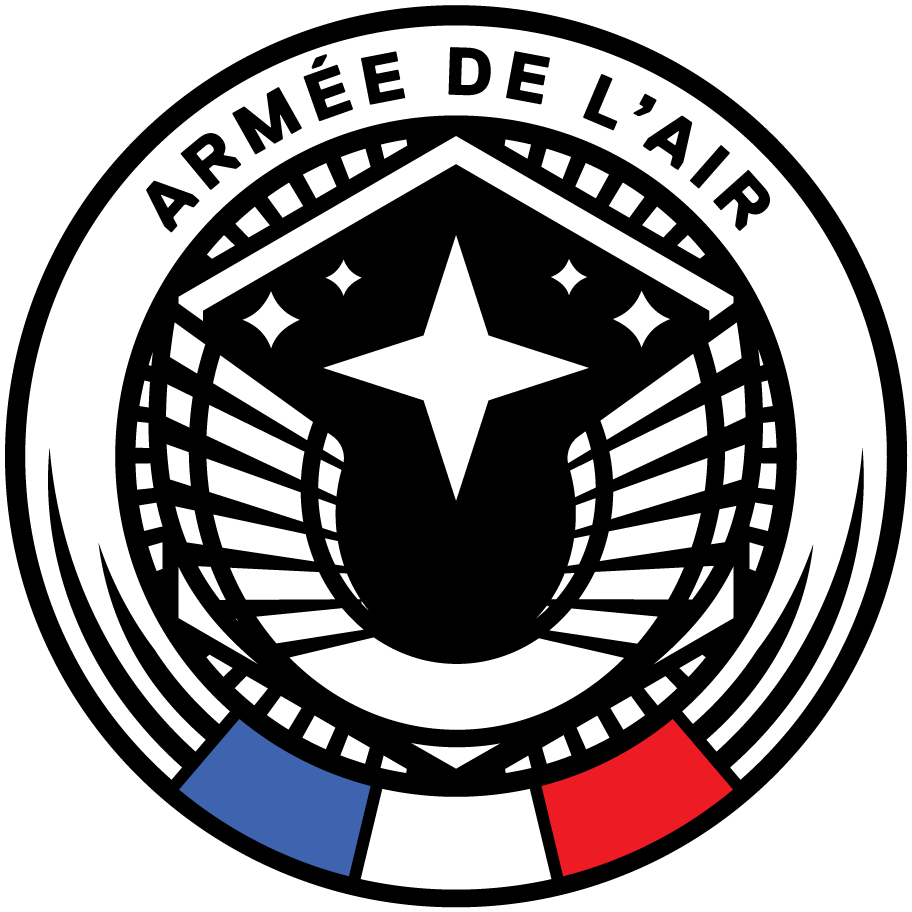
L’armée de l’air ( et de l’espace )
I’ve brought back the aviator’s wings on a celestial background to evoke space, the new frontier of this Army.
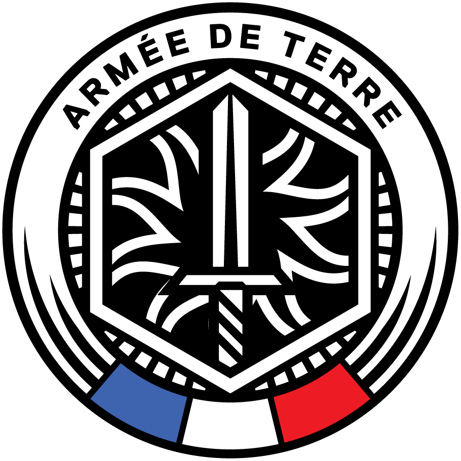
L’armée de terre.
Once again I’ve brought back the sword, this time on a background of fire strips. The different corps of the army (engineers, signals, …, and even … aviation) all have different symbols, it’s one of the oldest weapons and finding a unity is complex. I chose the symbol of the bomb and flames, which is the most commonly used symbolism, but I didn’t use it literally.
Reality Check
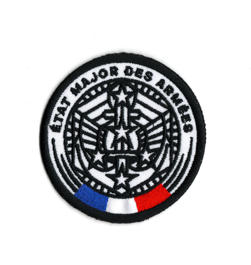
Bragging is funny, but if those designs are shoulders patches, how does reality checks?
I used the cheapest and quickest service around to order a single sample patch: Printful. Their service is fully automated, so an algorithm will digitize the patch design and runs an automated weaving paths approximation. This is not optimal and a weave machine operator at a patch factory can do much better. Even vinyl patches allows for a much better definition. Anyway, let’s do a crash test with the densest model and a medium-size patch (7.5cm). Do we pass?
A Final word
I have a deep respect for the French Army, the institution and the fighters, that is partly why I submitted to this exercise and spent so much time working on this project on my spared time. And because I pay respect to them, I would love them to display an iconography that could measure to this greatness. Something noble and in tune with their lineage.
Honneur et Patrie!
